One should start by coming up with one line that represents the main conflict of the movie, select one idea visually, and design the layout of the poster, ensuring that the title and imagery used represent the genre of the movie.
How to Plan an Original Drama Poster That Still Reads at Thumbnail Size
POST BY
PUBLISHED
October, 9, 2026
However, since a drama poster has to catch attention within a very brief period of time, it often contains faces, beautiful fonts, and colors that might impress when displayed in full size but do not seem impressive at all in thumbnails.
The real test is creating an original poster design that gives the mood of the show or movie and hints at what its central conflict might be.
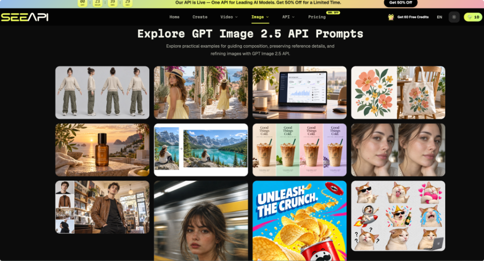
It is not just about choosing an image, but also about composition, considering where and what the title will go and how to create visual flow to catch the viewer’s attention immediately. For testing some ideas, one could use an application such as the Image 2.5 API.
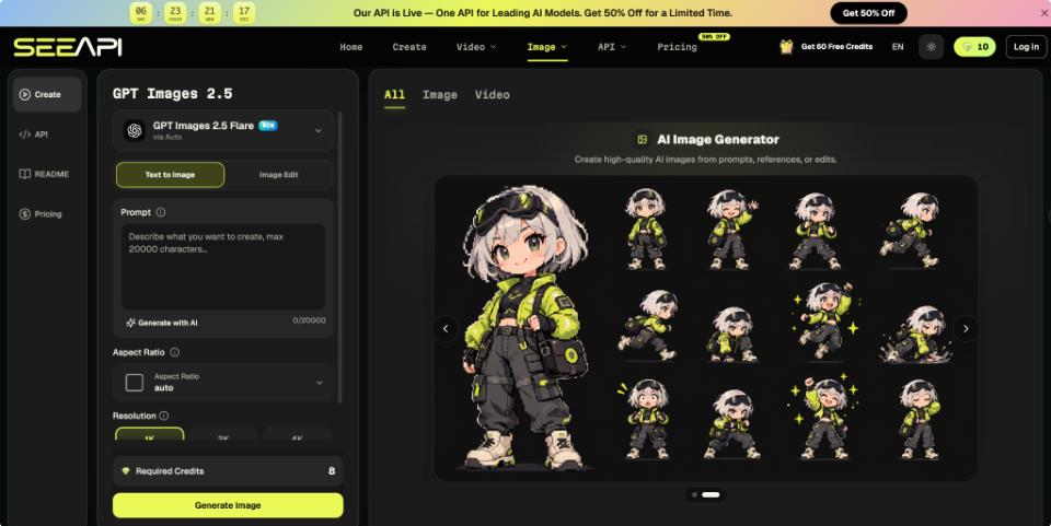
Table of Contents:
Decide What the Poster Must Promise
Before opening any tool, write the poster’s promise as a single line: who is in tension with whom, and over what. Take an original drama about two former business partners reopening a shuttered noodle shop. The line might read, “An uneasy reunion over a kitchen neither can leave.” Every element on the poster should serve that line, and anything that does not can be removed.
Next, choose the one element that carries the promise. In the noodle-shop example, it could be two people at opposite ends of a steel counter, with steam rising between them. A romance often relies on distance or contact between two figures, or on a mystery surrounding an object or an empty space. Pick one, then add two points that confirm the genre, such as warm lamplight for nostalgia or cold overhead tubes for suspense.
Show the line to a friend and ask what story they expect. If they name a different genre, rewrite the promise before designing anything.
Build a Layout Before Touching Any Image Tool
Posters fail at small sizes because every element competes. Draw a rough portrait rectangle and separate it into three zones: a focal zone for the main figures or object, a title zone with clear space around it, and a quiet margin that gives the eye somewhere to rest. A slightly off-centre focal zone and a title in the lower third keep the faces free of lettering.
Decide the crop now. Posters are reused as square social cards, so mark which component must survive one. In the noodle-shop sketch, the counter and the gap between the two people stay inside the square, while the steam can be cut. Write the title beside the sketch and note its length, since long titles require more horizontal room than most people expect.
Then squint at the sketch. If you can still name the focal zone and locate the title, the layout is prepared. If two zones seem equally loud, remove one.
Turn the Brief into Three Controlled Drafts
With a promise and a layout fixed, drafting becomes a comparison exercise. Three habits keep the drafts comparable.
1.Fix the Subject and Setting
Write the subject, setting, and lighting in plain nouns: two adults at opposite ends of a steel counter, a closed noodle shop at night, warm light from a single lamp. Add the layout instruction, such as “leave the lower third empty for a title”. Avoid real actors, existing characters, and borrowed logos; a typical room serves an original concept better than a famous face.
2. Attach a Reference and Name What Stays
Refer to an example if the characters have to appear in more than one poster or if a rough sketch already has the composition desired. With ChatGPT Images 2.5 API, you can submit a written brief together with a reference image, and choose between a model option aimed at everyday generation and another aimed at editing precision.
Give it three inputs: the reference, the scene to build around it, and the details that must remain, such as the dark blue apron and the counter’s position. Thereafter, compare the draft against the reference and check whether those elements survived and the lighting matches your brief.
3. Change One Variable per Draft
Alter only one thing per draft: first the camera distance, then the lighting, then the colour temperature. If everything switches at once, you cannot tell which change helped. Note the variable and your verdict beside each draft.
Check Drafts at Thumbnail Size, Then Revise
Shrink each draft to the width of a phone thumbnail and judge it before looking at detail. Then open it at full size for faults that only occur up close. A draft passes when:
- The focal zone can be recognized within two seconds;
- the title area is empty and legible;
- the figures’ relationship matches your promise line;
- hands, steam and edges look believable at full size.
A draft requires revision when:
- background detail crowds the title area;
- faces move away from the reference across the different versions;
- Stray lettering appears on signs or clothing;
- the lighting suggests a different genre.
Revisions can be made by mentioning what needs changing and what should remain the same. If the wall is too bright, ask for a darker wall colour while keeping the pose, clothing, and framing. When a draft is nearly right, make a narrower edit to it instead of regenerating, which tends to lose the parts you liked. Add the title lettering in a design app, where you control font and spacing.
Keep the Brief and Reuse It for Later Posters
The process is short: write down the promise, draw the zones, write one variable at a time, and then assess at thumbnail scale before finalizing. Each step produces something the next step needs. The promise decides the layout, the layout decides what the drafts must contain, and the thumbnail check shows which draft deserves the final edit.
Store your one-line promise, sketch, and the notes for the drafts in the same file. When an episode poster, a character card or a banner is needed later, you start from a settled brief instead of a blank page, and the whole set stays recognisably related. Over a few projects, the notes also expose your own habits, such as always crowding the title zone or favouring the same colour temperature, so you can correct them early and spend your drafts on the story rather than on repeated mistakes.
FAQs
How can one design an original poster for the drama movie?
What contributes to the effectiveness of a drama poster?
A focal point, good composition, appropriate lighting, harmonious colors, and clear typography all contribute to an effective poster.
How many words should an original drama poster have?
Include only the title and a tagline if required, along with any other important information like credits. More text would compete with the main visual and become illegible in reduced sizes.
How can one determine whether a drama poster is done?
Shrink it to the size at which the poster will be seen by people. If the focus is visible, the title is legible, and the image conveys the desired mood, the poster is good to go.
Related Posts