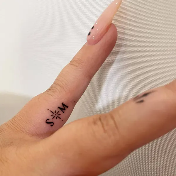
Ans: It usually comes down to your personal choice, but mostly micro-lettering tattoos are placed on areas where they appear kind of “hidden” in a way, the side of the finger, behind the ear, or on the ribcage are some of them.
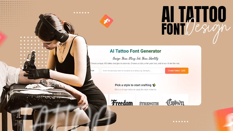
Hidden Narratives: Designing Stable Micro-Lettering with an AI Tattoo Font Generator
POST BY
PUBLISHED
March, 13, 2026
As tattoo designs reform and change with time, from large, bold sleeves of vibrant artistry to the intricacies of micro-lettering, one thing that still remains common among both is planning.
Without the correct preparation, even a profound quote or design on the side of a finger, behind the ear, or ribcage can quickly devolve into an illegible dark smudge.
This is where an AI tattoo font generator can help visualize and plan your miniature story, ensuring the structural integrity of your design remains intact when reduced to a small scale. Let’s check out how.
Key Takeaways
- Understanding the technical anatomy of a micro-tattoo
- Learning about the best styles used for creating a stable and clear micro-lettering tattoo
- Considering the EEAT principles for appropriate planning
- Designing according to the placement of the tattoo
The Technical Anatomy of Micro-Tattoos: X-Height and Proportion
When you shrink a font down to a height of 5mm or less, the physics of ink changes. In my professional experience analyzing visual performance, the most critical factor for success in micro-lettering is the “x-height”—the height of the lowercase letters.
If the x-height is too small relative to the ascenders (like the top of a ‘t’ or ‘h’) and descenders (the bottom of a ‘y’ or ‘p’), the eye struggles to distinguish the individual characters.
Using a tattoo font generator allows you to audit these proportions before the needle even touches the dermis. For micro-tattoos, you need a typeface with a large x-height and generous open counters (the holes inside letters like ‘o’ and ‘a’).
Now, if these spaces get too cramped in the digital view, the migration of ink over the years might close the gaps and end up making your creation look distorted. So, selection of the right font with a clear emphasis on clarity ensures your tattoo is pre-optimized for the long-term.
Avoiding the “Ink Blob”: Why Stability Matters in Minimalist Design
The usual pain point of people who want to get a micro-lettering style tattoo is the fear of it being blurry. In the tattooing space, this is mostly caused by the ink spreading inside the skin layers. While the design of the tattoo depends on the skill of the artist, the font’s architecture remains its foundation.
A stable font for micro-lettering must be “sharp” and “clean.” This means avoiding overly decorative serifs or fine, hair-like flourishes that the human skin simply cannot hold at a tiny scale.
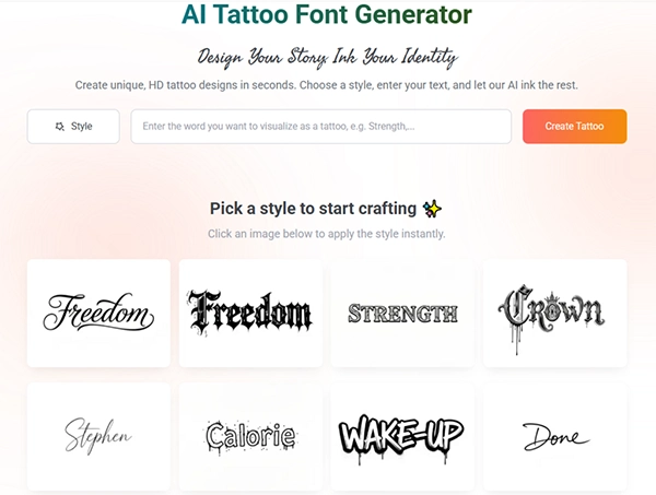
When you utilize the tattoo font generator at Refont, you can filter for minimalist and sans-serif styles that prioritise geometric stability.
These fonts are designed with consistent stroke weights. In the world of GA4 and SEO, we prioritize “Core Web Vitals” to ensure a smooth user experience; in tattooing, the “Core Design Vitals” of your font determine the lifetime value of your ink.
A stable, high-legibility font ensures that even if a slight amount of ink migration occurs over twenty years, the “skeleton” of the letter remains recognizable.
Choosing the Best Styles for Secret Narratives
Not every font is a candidate for micro-lettering. To hide a secret narrative effectively while maintaining beauty, you must be strategic in the tattoo font generator interface.
1. Geometric Sans-Serifs
These are the safest and often most elegant choices for micro-work. Because they lack decorative “feet” (serifs), there is less visual noise. At a size of 3mm, a geometric sans-serif maintains its identity perfectly. This style is ideal for those who want a “modern-medical” or “technical” aesthetic that looks crisp on the inner wrist or collarbone.
2. Monolinear Scripts
If you prefer the romance of handwriting but want it tiny, look for monolinear scripts.
These fonts have consistent thickness throughout each letter. Traditional calligraphy, with its varied thick and thin strokes, is dangerous for micro-tattoos because the thin lines may disappear while the thick lines expand.
A monolinear font script generated with a professional design tool gives you an idea of the uniformity needed for a visually stable tattoo.
3. Typewriter and Fixed-Width Fonts
There is a specific charm to typewriter-style fonts for secret messages. They carry an air of “confidentiality” and “documentation.” Because typewriter fonts are designed for clarity on paper, they translate exceptionally well to the skin at small scales.
This tattoo font generator allows you to verify spaces between each letter to ensure each character has a uniform breathing room, which is crucial to prevent the merging of the design into a single line.
Fun fact
The oldest known human tattoos belonged to Ötzi the Iceman (circa 3370-3100 BC), who had approximately 61 visible markings.
EEAT Principles: Expertise in Small-Scale Precision
- Expertise: A dedicated generator reflects the expertise of typographers who understand how ink behaves. They provide “optimized” versions of fonts that are safer for the dermis than standard system fonts.
- Experience: Use the digital preview to simulate the “distance view.” Shrink the image on your phone and hold it at arm’s length. If you can still tell it’s text, you’ve chosen well.
- Authoritativeness: Consult with a specialized artist experienced in micro-lettering and precision work. They will appreciate that you used a professional tool to bring them a design with stable proportions.
- Trustworthiness: Trust is built on transparency. By using a generator to create a clear, high-resolution stencil, you provide your artist with a trustworthy map to follow.
Designing for the “Unseen”: Placement and Privacy
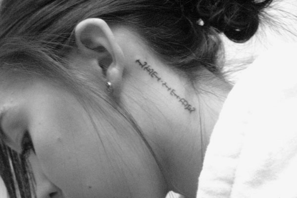
The beauty behind the micro-lettering style is its ability to appear “hidden” in a way. However, the skin is not uniform. The skin on your fingers and palms regenerates faster than your forearm skin, leading to faster fading or blurring.
When you are in the tattoo font generator, consider the “weight” of your secret. Choosing a slightly bolder font when planning to wear the tattoo on a high-friction area, like a finger, compensates for natural fading.
If it’s in a protected area like the ribs, you can go as fine as the technology allows. The generator gives you the power to toggle these weights until the balance is perfect for your specific anatomical location.
Conclusion: The Power of the Small
Micro-lettering is proof that a tattoo need not always be loud and appear powerful and big to be considered a great design. Hiding a narrative in a tiny spot, with a stable script, creates a permanent anchor for your personal history. But remember: the smaller the design, the smaller the margin for error.
Use a tattoo font generator to stress-test your proportions, audit the dimensions, and plan your design before its execution, leaving nothing to chance for your secret narrative’s beauty.
Whether it is a single word that keeps you grounded or a date that only you understand, make sure it is designed with the technical precision it deserves. Your secrets are worth the extra effort of digital optimization.
Q1) Where ideally should a micro-lettering tattoo be placed?
Q2) What is the EEAT principle for small-scale tattoos?
Ans: Expertise, Experience, Authoritativeness, and Trustworthiness make up the EEAT principle.
Q3) What are the things to watch out for while considering a micro-lettering tattoo?
Ans: One of the most important things to consider is getting a visual idea of how you want the tattoo to look and the font you wish to go for. These factors can be decided with a digital tool.
Q4) What are the styles that are most suitable for a micro design tattoo?
Ans: Geometric sans-serif, Monolinear script, and Typewriter scripts are the most suitable font styles for a small-sized tattoo.
Related Posts